

It was a very hot day, but a fine and pleasant day nonetheless.
I went to Comuna, a creative community located at 238 P. Ocampo Sr. Ext., Makati. This 3-story building houses several restaurants, brands, offices, and even health and wellness centers. It’s still being constructed so watch for all the stores to open soon.
That afternoon, I went to Manila Middle Ground and RiseSpace Art Gallery.
Manila Middle Ground
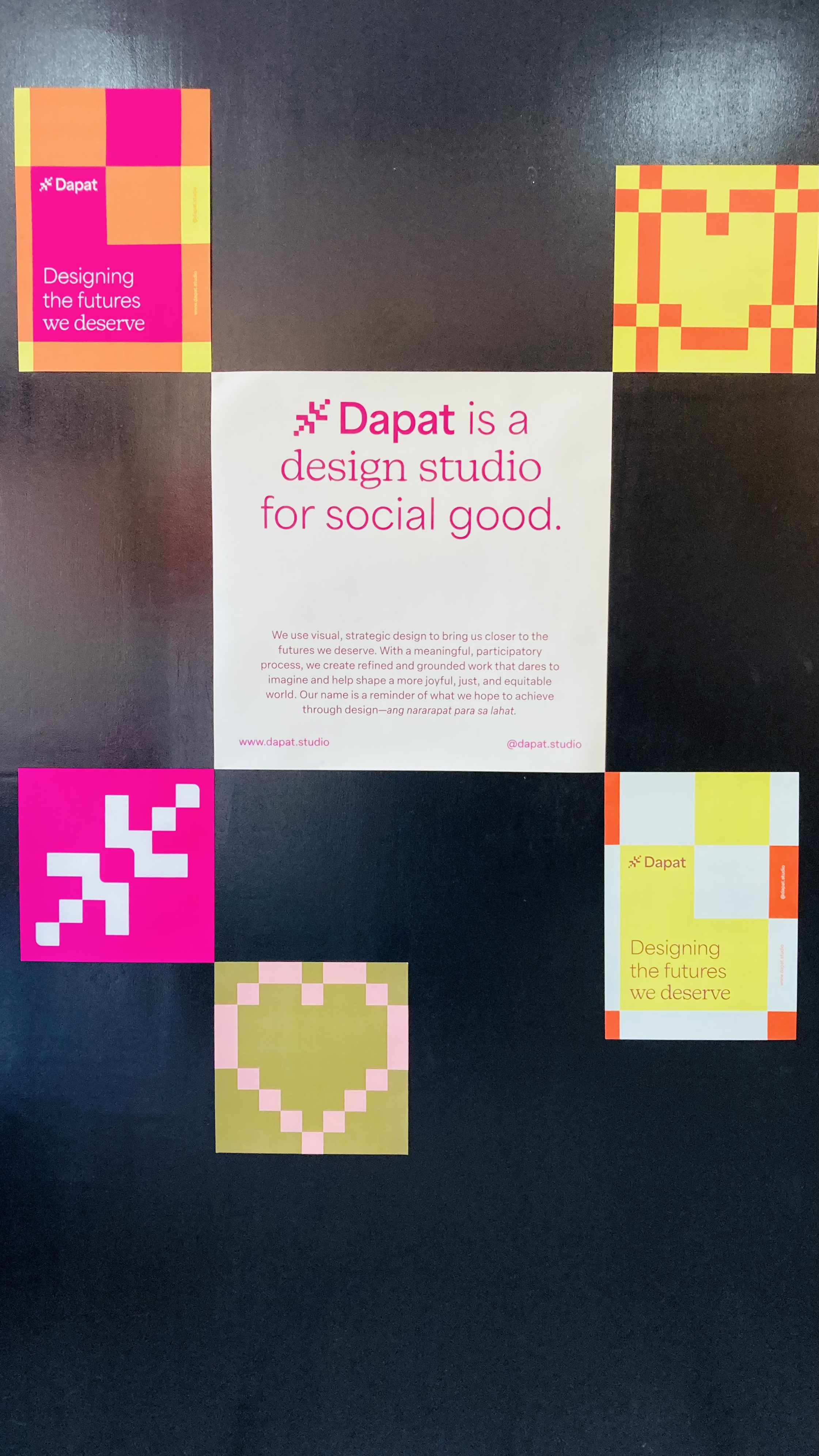

Manila Middle Ground is a creative retail and events space, which hosted Designing Futures, an exhibit celebrating a decade of design for social good by Dapat Studio. They create messages of a better future through branding and designing campaign, print and publication, and web, as well as imagine new ways to do good through designing programs, products, and discoveries.
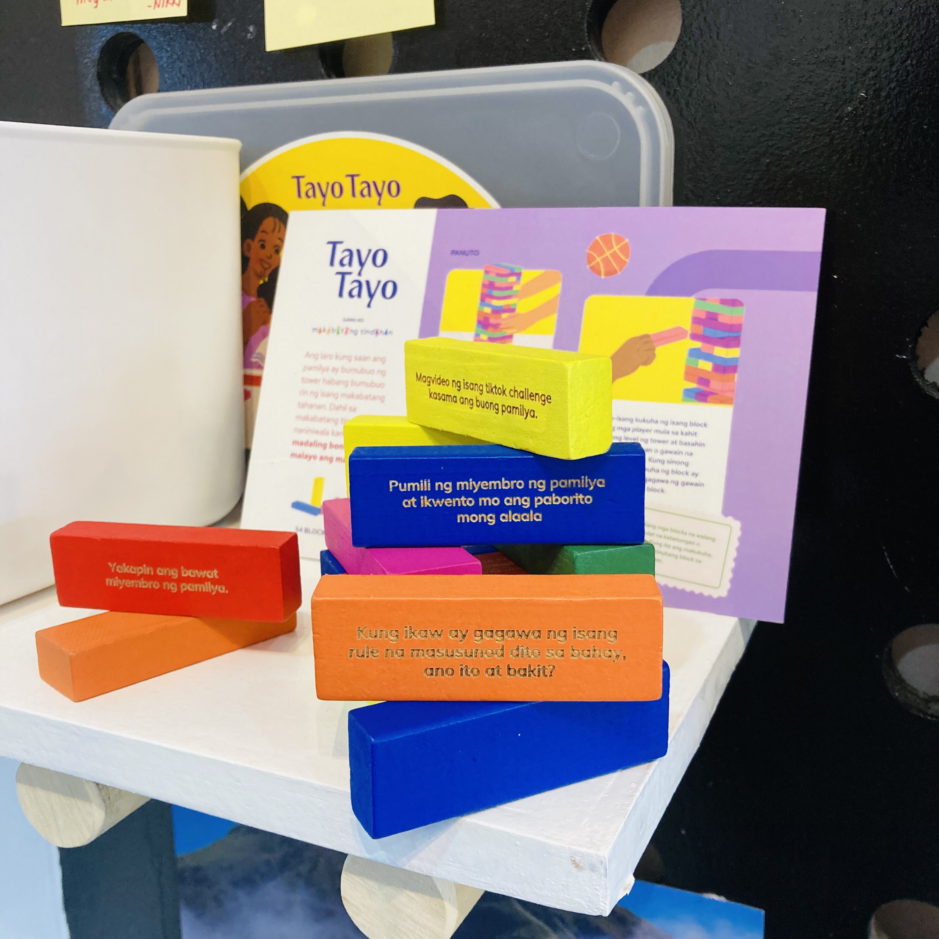
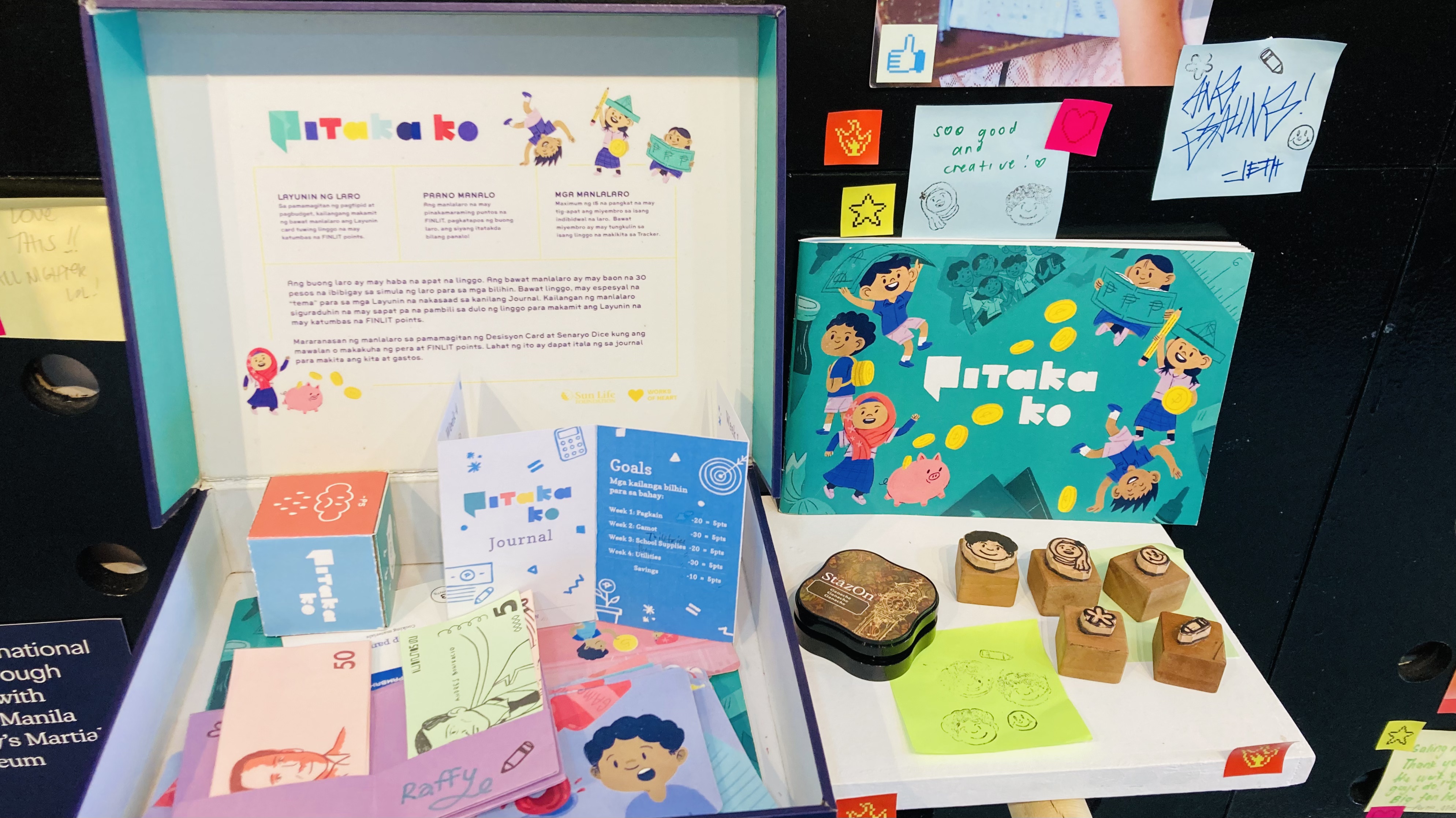
The exhibit was small but packed with meaning. On display were their different projects on health, arts and culture, education, vulnerable groups, livelihood, and sustainability. What caught my eye were Tayo Tayo and Pitaka Ko (two upper right photos). Tayo Tayo (Let’s Stand) is a Jenga-like game that teaches children their rights. Pitaka Ko (My Wallet) is a role-playing game for students to practice budgeting and saving.
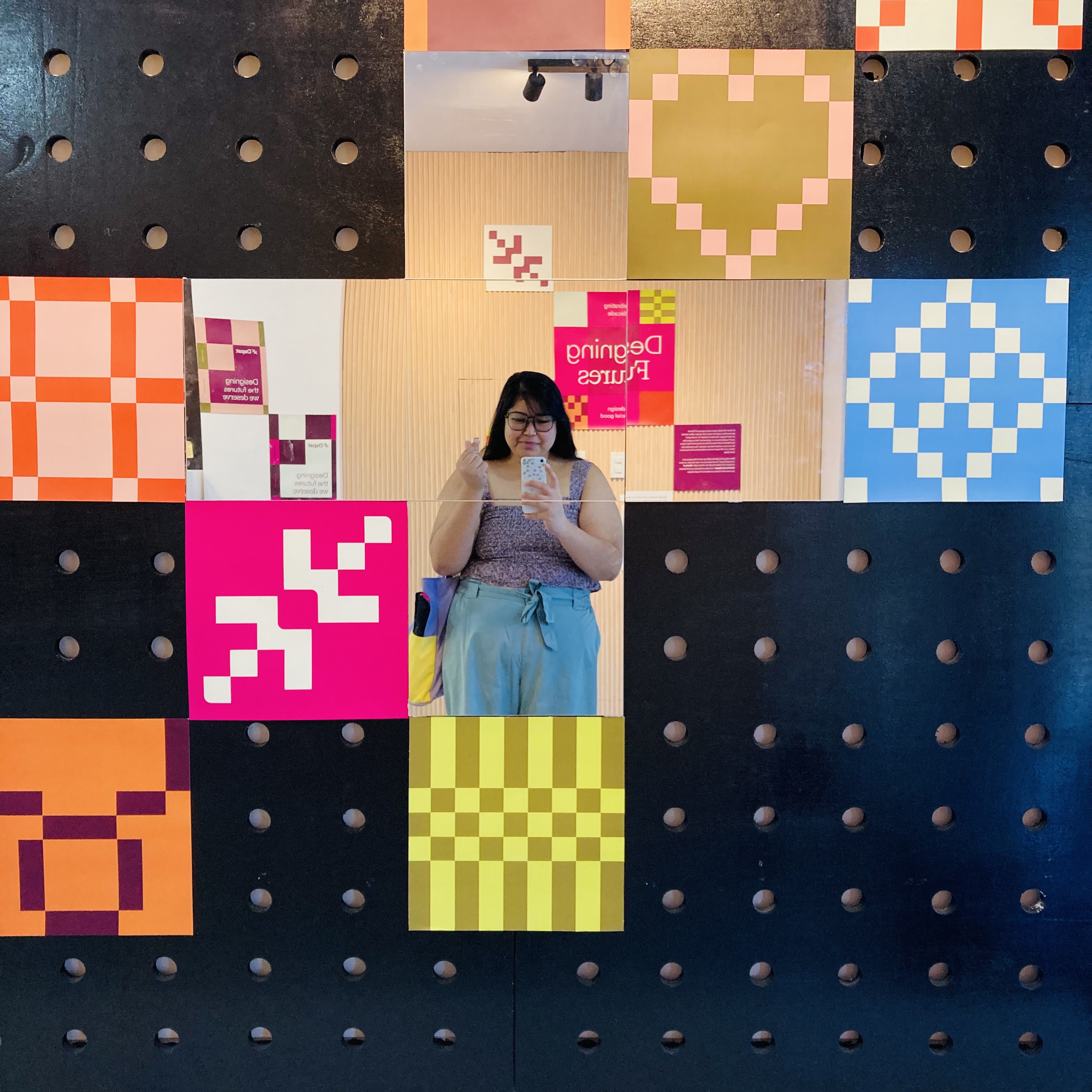
Scattered throughout the panels were post-its and stickers, which you can use to interact and engage with. On the last wall, they asked, Ano ang karat-dapat para sa Pilipinas? At paano makakatulong ang design?, or What is worthy for the Philippines? And how can design help? People were invited to write their answers on post-its and even build upon other peoples’ responses. One said “Design for Remembrance” to which of course I replied “Yes to memory! Salamisim was here!”
RiseSpace Art Gallery
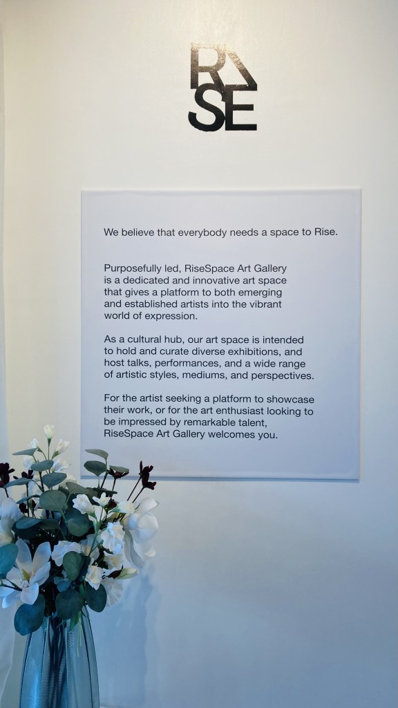
Another space I visited was RiseSpace Art Gallery. I was warmly greeted by Erwin Canlas, one of the gallery owners and artists showing their work in the inaugural exhibit VISIONS.
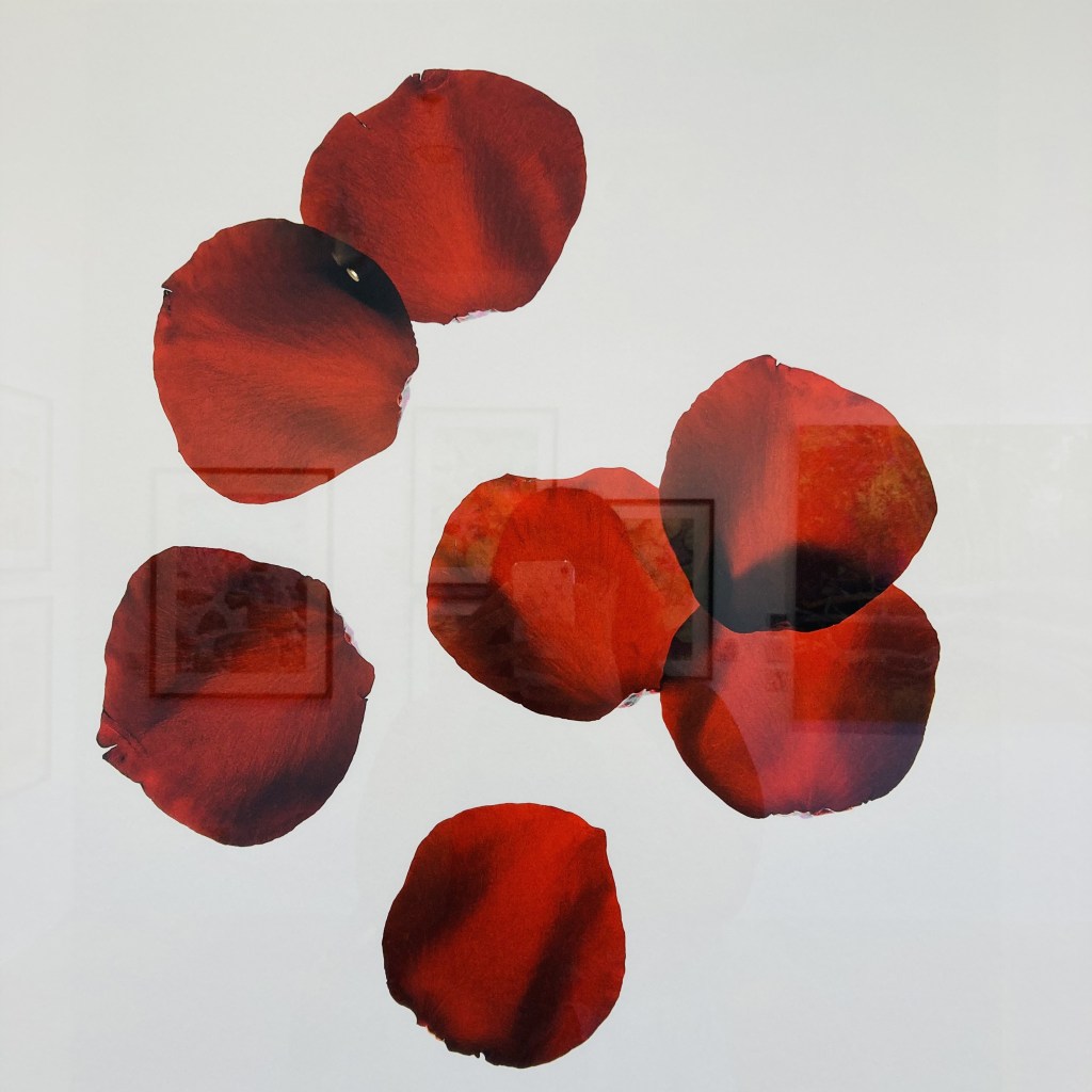
Erwin is a fashion and commercial photographer producing clean and experimental images of youth and freedom. In VISIONS, he displays five vivid and layered photos of different flowers representing his family members. I was so taken with Red (photo below).
The title IT WILL NEVER WITHER just pierced my heart. It is hopeful but also painful. He mentioned he gave these pieces that title because the petals would literally wither as he arranged them for the shoot. By capturing them in these shots though, he has immortalized what seemed to be ephemeral and fleeting.
It was also quite interesting to listen to him go through his creative process like how he placed the light source at the bottom and manually made the layers with several glass panels. He also carefully sourced the paper, which completed the look and feel of his pictures.
I didn’t plan on going to this gallery but I’m very glad I went.
Erwin L. Canlas
IT WILL NEVER WITHER
Red
Edition of 10
2023
Photograph, print on paper
Hahnemuhle Agave, 290 gsm
25 x 25 in.
What do you think?
How did this make you feel? Let me know in the comments.
On my next post, I’ll talk about my two-night dance escapades.
Remember. Reminisce. Reflect.
Salamisim out.
